This is an exciting time. As Paul scribes away and writes his stories on the wild saints, I will be making images alongside them. This substack will be an addition to those posts, focussing on the processes of creating images and perhaps some other art related topics. I know sometimes the mystery of art is its appeal. Like the films of David Lynch who is often very vague and shrouded about his intent or meaning in his films, leaving viewers to explore and wonder, what on earth does this all mean? The mystery is alluring. Yet I always enjoy a directors cut, with little insights. I think it can sometimes give more depth and a richer appreciation into the work created. So I do hope this may function the same.
Creating work of holy men and women ought to be treated with reverence and humility. The stories inform the composition, but so does the work of the masters who came before. To make good art we need a good diet of art. We are what we eat and we draw what we see. I tend to be drawn to the old, things chiselled in stone or wood. There is a permeance to them, these pieces were meant to last.
“In the Middle Ages men had no great thought that they did not write down in stone” Victor HugoI love this quote, if it was important to say, it should be said for thousands of years in stone. In contrast to this, there is the fluid art landscape we see nowadays, which has been picked apart and torn limb from limb since the birth of modernism. So much so that it has lost its form, it sometimes seems like a practical joke and often is. I see a parallel of contemporary art with contemporary food. I’m thinking of the homogenised malnourished gloop, ready meals and McDonalds. The stuff which has the nutritional value of cardboard and lots of sugar, it does more harm than good.
I do believe when it comes to the creation of artworks, there is a standard, and this we can learn from past masters of the craft. All great art is religious, it has always been this way and always will be the case. By religious, I mean aiming for something higher than man, the expression of the immaterial through material, the reflections of truth formalised in beauty.
Art isn’t a science, there is no formula or equation to how these works are created, but I think it lies in something of the discipline of the mind, a nobleness of imagination, and it takes place within the realm of the spirit, there is a mystery to it. This traditional, ancient form of art is the expression of ideas and truth, through symbol and meaning. It is a way for the artist to distil singular distinct moments of existence into a image, an impression of truth. In this there is the aspiration for the beautiful, the yearning for the ideal, in art and in life we can begin to know the image in which we are made in.
To create a religious work, one ought to live a religious life. This type of life is one of discipline, and this allows someone to work and act in a manner not guided by man but by God. This is a standard to aim for, and I know I fall very short of it, but I do strive. So I hope this will come through in the work to come.
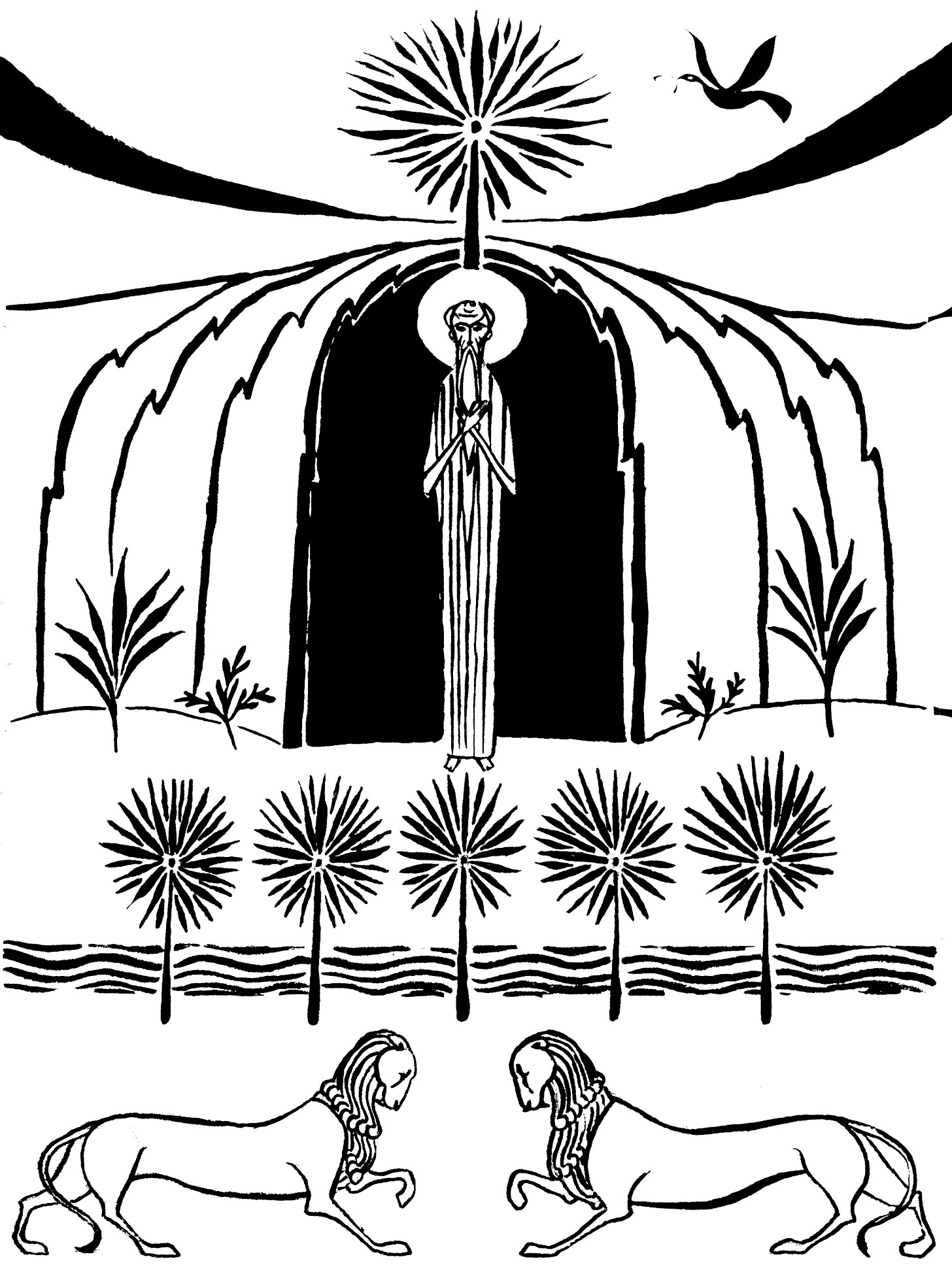
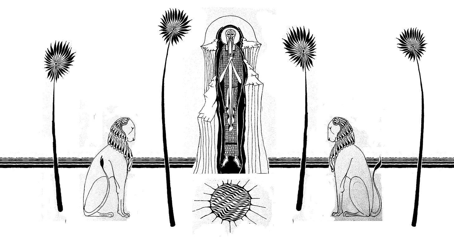
My first response to the story of St. Paul of Thebes was the sacrifice he made. Of course, sacrifice is a key component to Christianity. But in sacrifice there is love, St Paul went out there for the love of God. In the stripping away, and the austere asceticism in his life his call of love wasn’t unheard but answered, God nourished him. For the image I wanted to create something stripped back and simple. I wanted the austerity of the desert to be the central theme, the less is more way of thinking. It can be difficult to know when you’ve hit the right balance of a minimalistic approach. If Goldilocks were to choose a minimal art work instead of porridge, it would be something like way too cluttered, way too little, ah just right! There are wonders of simple beauty in examples like the refined excellency of the Cisctercian Abbeys of France, which achieve a restrained harmony in geometric masonry capturing beauty in stone and light. The opposite end of austere is a 1960s tower block or perhaps a dentists waiting room, which are often bleakly austere. Less is more sometimes, but a lot of contemporary examples reveal less is less. So hopefully the balance was struck in this new print.
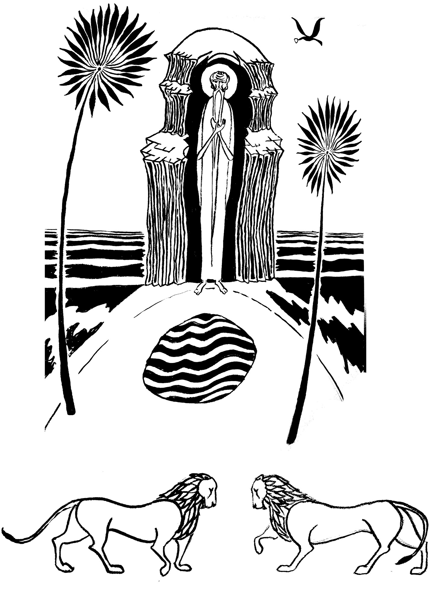
Here are my initial sketches:
I very much liked the imagery of the lions bowing their heads to one another. I then produced a more refined sketch of the one I favoured, which I thought caught a portrait of the story well:
I liked the idea of it being portrait, Paul thought the images work best landscape for the substack, and he was right! Thankfully the landscape orientation allowed more space, and opened the image up (excuse the rudimentary photoshop editing!):
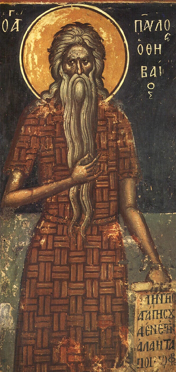
The inspiration from these works came from a mixture of sources, of course at the heart of it was the iconography of St Paul of Thebes. These are often showing him with a great big bushy beard and a woven palm tunic, the unkempt and flowing beard usually symbolises a hermit. I am fond of this Cretan Icon from 1545:
I decided to have St Paul with his arms crossed, symbolising humility, repentance and submission. It seemed right for St Paul, given his whole life was given to serve in prayer.
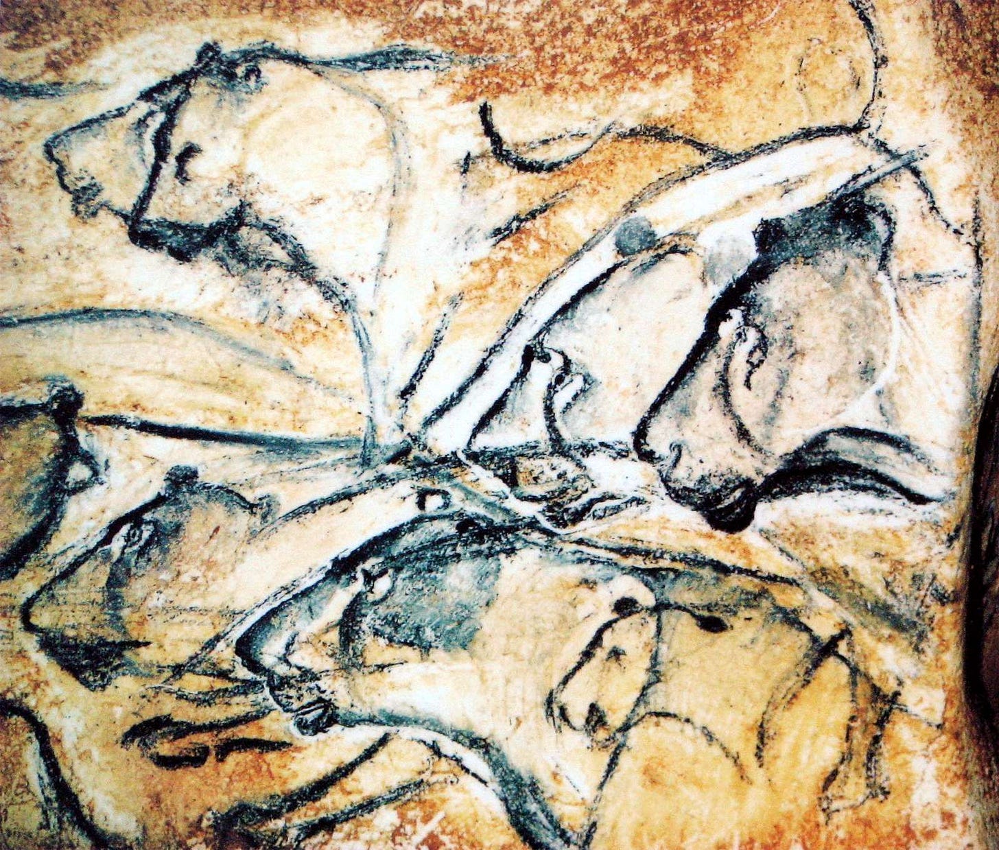
The lions are a mixture, I adore the painted lions and other animals in the caves at Lascaux. It’s astonishing to think of these being so ancient, they are so tenderly observed.
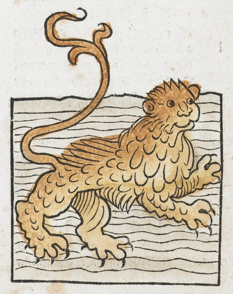
I wanted to capture an element of these paintings, whilst drawing other elements from medieval work. I know the medieval lion has become a bit of a meme, because of how they are depicted. I think they have a lot of charm.
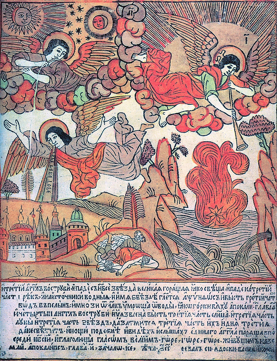
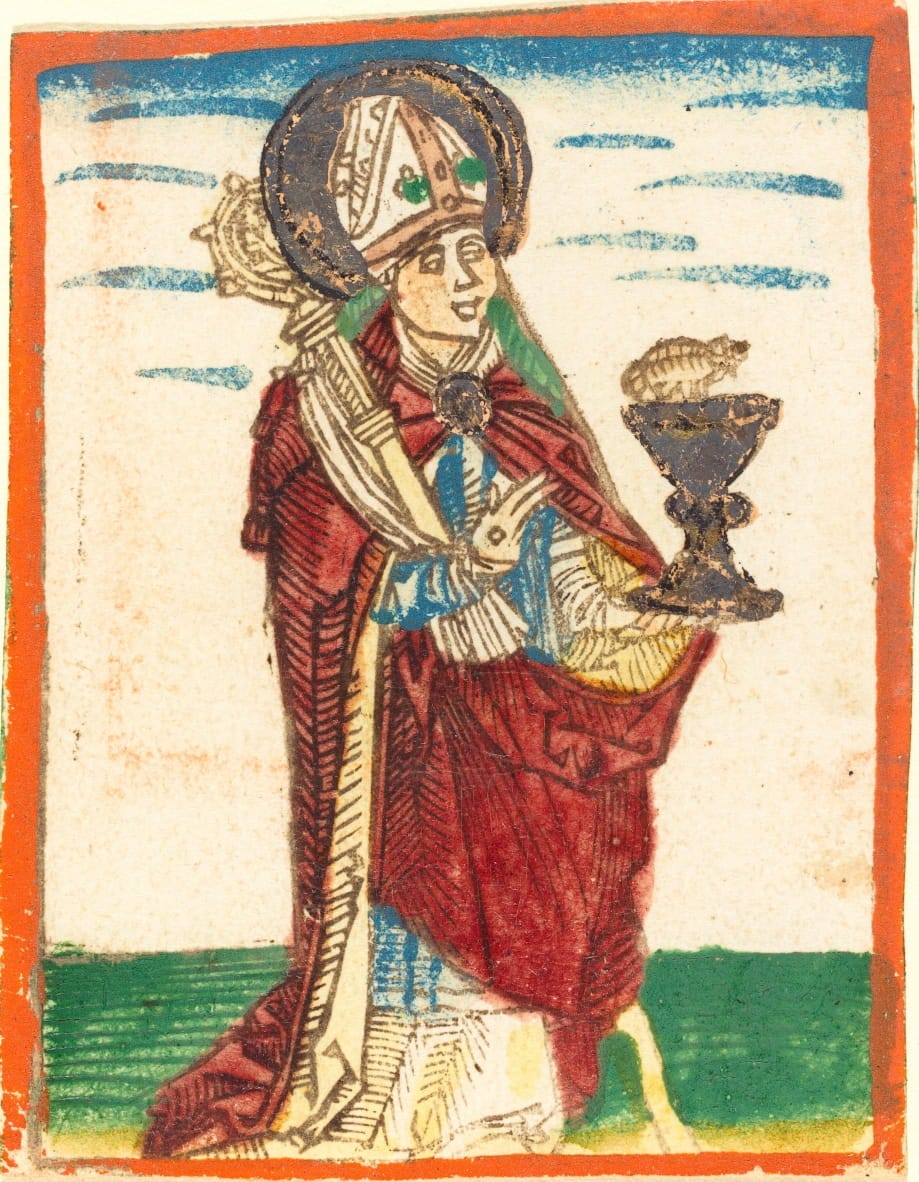
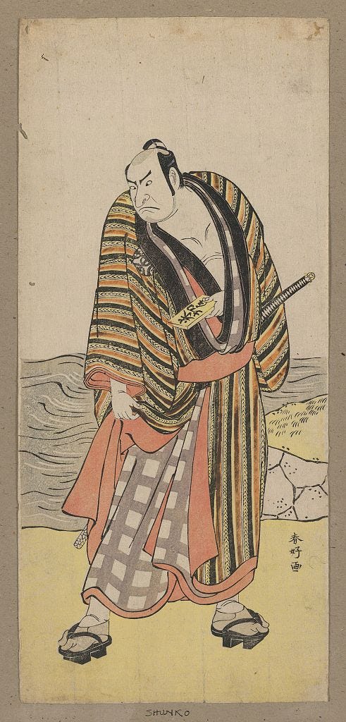
Once the draft was set, the image was ready to be carved for printing. I thought it would be good to introduce colour into this series. I saw an exhibition on Japanese prints and was stunned by the subtle colours. I thought this visual language was superb, and I wanted to try to learn it. Western prints from the medieval period are often bolder in line, utilising linear black quality. The most renown form of woodblock printing in Western history are known as Popular Prints, these are wonderful works often finished by hand painting. There are visually some parallels to the Western and Eastern style. Both started with purely monochrome prints, and were hand-painted afterwards. It was in Japan that the woodblock technique was pushed further though.
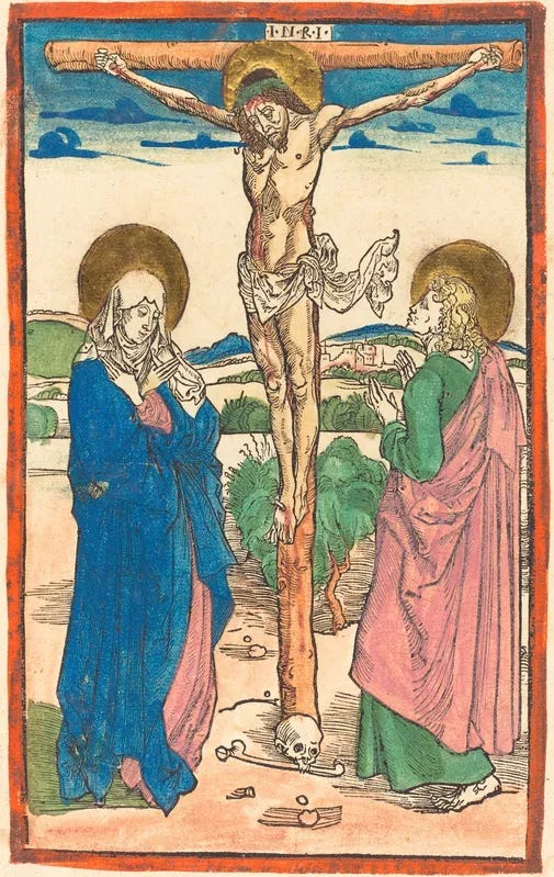
What I enjoy in the Eastern print is the nuance and delicacy in line work and colour. I think the Japanese print achieves a wonderfully rounded work, where the graphic intensity isn’t as strong. One reason for this is the materials, a rice paste and pigment is mixed on the block, which allows for a uniform or gradient application of colour and some transparency, aiding to the luminosity of finish. I don’t wish to create an image that is Christian and Western iconography emulating the style of Japanese woodcut but a synthesis of the two, where the process and technique is applied to a western aesthetic. As I still enjoy the boldness and directness of the Medieval print. This certainly isn’t anything new, there is a wonderful Bible hailing from Russia, titled the Korean Picture Bible. It’s style is a mixture of the Korean woodcut and Russian Lubok iconography.
I feel like a musician practising their scales. I must of produced 60+ failed prints. But as the 1st edition of these prints are, each one has a little variation, which is how I usually like to work in all my pieces. I have often thought that you could use that as an excuse for shoddy craftsmanship, but in a way perfect reproduction is very much a machine based operation, and in the words of Charles Babbage, there is an unerring certainty to machinery. There is no room for human foibles or charm, the CNC machine carves in cold, sterile perfection, churning out replicas of dull effect. There is no one leaf the same in nature, so I have been fond of embracing the quirks.
Here is a video showing moments of the process, this was one of my earlier prints. I later changed the vibrancy of the colour, as I imagine the brightness of the sky in the desert is startling.
As this series continues, so shall my dexterity in this technique. So I am very glad to be able to nurture this and hopefully create more harmonious prints with a good finish. This one I like, but I do think I can improve, I think you stop being an artist when you settle with your work , thinking there’s no room for improvement. Here’s to the next print!
What’s to come……
I will be writing posts like this one on various commissions that I’m working on, I have some carving commissions and other bits and bobs coming up which I would be delighted to share the process of.
I am writing a post on the history of the woodcut which I think may add some further context to this series, I shall post that soon. It is a fascinating area, and was very much the start of mass communication and printed matter.
Another piece that you may enjoy is a small illustrated introduction to my practice, showing examples of previous work and how on earth I ended up doing this kind of thing.
I have seen some people asking if these prints will be available to purchase, the answer is yes! The plan is to do an edition of each print as the series go. I have the 1st edition available here: https://www.ewancraig-art.com/category/all-products



Thank you sharing this insight into your technique. In the process of obtaining my art degree oh so many years ago, we spent time creating lino cut illustrations and, as much as the process fascinated me, my lack of patience in carving eventually sucked the joy out. I am not sure that issue with patience has changed all that much over the years but I will enjoy reading and learning from your skilled hands. Plus, the video made me smile. Well done! Onward...
The excellent video provides additional context for your work...as well as for many other aspects of being human that are confronting us these days.